

Sequels were around before the 1980s, but only in that decade did Hollywood’s accountants realise that they could take any existing film, re-sign at least one member of the cast, chuck some Roman numerals after the title, and then never need to pay for an original idea again.
How fitting, then, that Jersey recently celebrated the ’80s with a sequel of its own: the latest instalment of its Popular Culture series. I’ve been following this series since the 1960s issue in 2018, which was followed by the 1970s issue from 2019. (A 1950s issue kicked it off in 2016, but I totally missed it at the time.)
In this case, the sequel is no bad thing. And just like so many 1980s sequels, these Popular Culture stamps look terrible, which is why I give them my whole-hearted thumbs-up.
No, really. The ’80s are treated with reverence these days as people who weren’t there the first time around re-discover its delights. The Spring/Summer 2021 shows dragged polka dots and power suits back onto the fashion runways. Lady Gaga has been playing her keytar for a number of years now, but continues to be allowed to perform to the public. Hollywood has finally exhausted all possible sequels, so now they’re remaking Revenge of the Nerds.
But just when you thought it was safe to head out with your leg-warmers over your leotard, here comes Jersey to remind you just how truly awful the decade was:

We’re looking at the Souvenir Sheetlet in which the six stamps sit above a timeline of iconic 1980s moments. (The 1989 moment, ‘The World Wide Web is invented’, was barely noticed at the time, though of course much appreciated now.)
In keeping with the earlier issues, each stamp covers one aspect of the 1980s. Live Aid is hailed here as an ‘event’. There’s nothing particularly 1980s about that design other than the iconic logo. It captures the excitement of that groundbreaking global musical event, but then, it also could be ANY concert. Or perhaps I’m misreading it? Could it be that the enthusiastic hands belong not to excited concertgoers, but to corrupt local powerbrokers reaching for their cut of the proceeds as they make their way towards the intended recipients? Well now, THAT’S pretty 80s.
The other five stamps, however, are absolutely LOADED with throwback retro design elements that made the 1980s what they were, and warn us to be very careful if we choose to venture down that path again.
The standout number is the ‘language’ stamp. RAD! is not just the chosen example; it’s also the exact word that a young Punk Philatelist might have used to describe this design if he saw it adorning an off-brand skateboard. That ragged font with its inexplicably heavy drop-shadow, the TRON-inspired electronic grid lines, and those bolts of lightning – they triggered flashbacks. A lot of lightning just randomly showed up on stuff back then. It was a real problem.
In an era that brought us synth pop, hip hop, hair metal and Milli Vanilli, it must have been a long meeting the day Jersey Post sat down to decide which musical style to hail as the epitome of the Eighties. The New Romantics scored the gig. They belonged to a movement that propelled the new-ish sound of synthesizers into the pop charts, accompanied by appropriately ’80s levels of excess in fashion, lifestyle, and video clip budgets. Our hero here is soft-rocking some decent high hair, but is he New Romantic enough? The loosened bow tie is a perfect touch, and there is more than a nod to Duran Duran’s Rio album cover art here… but if you ask me, this singer stands at the straighter end of the fashion police lineup. I figure they don’t want to identify specific real-life individuals in this series, but I just reckon he could have done with a touch more make-up.
Not to worry. There’s plenty of make-up in the Fashion stamp, if you can spot it around those ENORMOUS shoulder pads. Women’s fashion wasn’t high on my radar as a primary-school-aged lad, but in this stamp I can immediately recognise the soap opera queens and female power-journos who got around looking like upside-down triangles. The slicked-up short hair, the print scarf and the heavy purple eyeliner (it matches the dress!) are some more delightful retro Easter eggs. Design-wise, the watercolour effect on the power suit captures a fashion-sketch urgency that offers a nice translucent contrast to the denser hues on the other stamps.
Which brings me to: the piña colada (‘food and drink’) and the boombox (‘leisure’). Again, the piña colada is not something I appreciated as a child; probably for the best. And I could only admire boomboxes from a safe distance as they sailed past me on the shoulders of people who my mum would yank me away from.
These two stamps demonstrate a classic 1980s design element: backgrounds cluttered with random shapes of no apparent relevance to the featured subject. Our heavy drop-shadows are back again here, and nice to see that the shadow directions are completely inconsistent. In the mid- to late-80s, no self-respecting ‘Smash Hits Way To Go!’-style compilation album, or opening credits of an American sitcom about a young black guy in a fish-out-of-water scenario, would be launched without a full supply of these thingamajigs and whatsits. The other squiggles and colour choices are on point, and one of my favourite little touches in this whole set is the fine print with which the boombox boasts that it offers STEREO (with each letter a different colour, too… chef’s kiss!). But would stereo have been enough to tempt me to buy this beast? Pfft! Not when it only has a single cassette deck! (If you’re under 25, ask your mum or dad why that’s bogus. And then ask what I mean by ‘bogus’.)
As in previous years, the six stamps are accompanied by a monster miniature sheet framing a £3 stamp (up from £2, I notice), the whole thing stylistically depicting a street scene from the era. Get ready to harness those lightning bolts to power your flux capacitor, we’re taking the Delorean back to 1985…
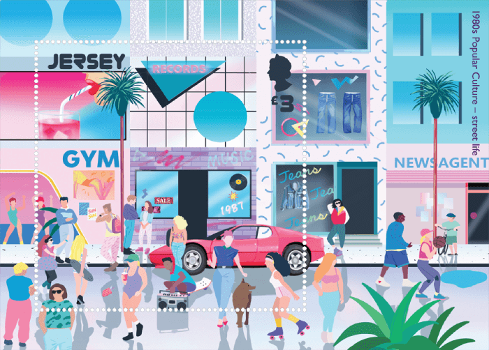
Our 1980s street looks much less busy than the equivalents in recent issues. Where did everyone go? It’s too early for them to be shopping online at home, the world wide web has only just been invented. Maybe they’ve caught the ferry to London to watch Live Aid. The 1950s street scene was also less populated, but the 1950s people were walking around doing 1950s things. The 1960s and 1970s street scenes were a visual feast. Here, the 1980s people, well… they’re a little bland. There’s a rollerskater and a basketballer and a skateboard dude with a boombox, but the locals here are playing only a supporting role to the scenery.
But oh, that scenery. This miniature sheet is like a final lesson where we put together everything we’ve learned before, and then learn a few more touches. Grid lines! Drop shadows! Washed-out pastels! Squiggles! Graffiti-style typography! Red sports cars! The Olivia Newton-John-esque workout happening in the gym! So much pink!
They greys stand out to me. Has everyone forgotten the greys? Maybe my memories are clouded by whatever hand-me-downs I was wearing at the time, but I remember a LOT of grey. It’s something that doesn’t seem to reappear when people bring ‘80s retro’ out to play these days.
That’s why, in spite of my nitpicking, I like this issue. In advertising campaigns or at fancy dress parties, modern recreations of the 1980s tend to reach only for the most exciting, memorable, laughable excesses of the era. What gets forgotten along the way is that it wasn’t all lightning bolts and shoulder pads. Much of the eighties aesthetic was bad. Hideous. This issue has not been shy to incorporate that element of the 1980s, and consequently, it did a fantastic job of transporting me back to this traumatic era. It reminds me so much of what there was to hate about the ’80s, and therefore, it succeeds perfectly at capturing the ’80s.
Not everyone in my household reacted like I did. (Maybe the greys I recall are the metaphorical, implanted by every second song being about how we’re all going to die in a nuclear war.) Mrs Punk, younger than me and a non-collector, caught site of these stamps as I wrote this article, and I have rarely seen her get so excited by my hobby. I asked what she liked about them. “The happy bold colours and cheesy fonts,” she replied, “and I had a pink stereo EXACTLY like that one.”
I think what she was trying to say was: RAD!
I believe that this is a five-part series, so at some time in the next 18 months, Jersey will take us back to the 1990s. Let’s guess what the featured subjects will be! The answers are likely to be UK-biased, and represent good vibes rather than downers. The regular categories are:
- Food and drink
- Music
- Events
- Language
- Leisure
- Fashion
Give us your guesses in the comments below! I’ll kick it off with mine.
STOP PRESS! This isn’t the only recent stamp sequel. Australia has just released its latest public mural issue, which I’ve tacked onto the end of the last one I covered. Have a look here.
Hit the Follow button or submit your email for regular Punk updates! You can also find me on Facebook, Twitter, and Instagram!
© Philatelic product images remain the copyright of issuing postal administrations and successor authorities
Discover more from Punk Philatelist
Subscribe to get the latest posts sent to your email.

Here are my guesses for the 1990s:
Food and drink: espresso-style coffee took off in the UK in the 1990s, so I’ll go with a ‘cappucino’
Music: Britpop
Events: Home internet
Language: No idea. I’ll say ‘www’ even though it’s a bit of a double-up.
Leisure: Video games
Fashion: Grunge. I know, grunge is also music. And it could be filed under ‘language’. Feel free to put it wherever you like.
What do you think?
LikeLiked by 1 person
I cant answer your question as i wasn’t in England in the 90’s however, i love reading your blog as i love how you put things in perspective. Very good reading and love the design of those stsmps. I lived the 80’s and loved it.
LikeLiked by 1 person
Mr. Punk, are you a glass half-empty kind of guy? Most people look back nostalgically on past times and remember the good stuff. I LOVE these stamps! Granted, I’m an old man, but those 80’s women with the shoulder pads and big hair were really rad!
Great article as always, you make philately really enjoyable.
LikeLiked by 2 people
Thanks for reading Robert! I assure you I do look back fondly on some aspects of the 80s… mainly the music (and, because I’m cool, also the stamps). The fashions, not so much!
LikeLiked by 1 person
The ‘90s is the best 🙂
LikeLiked by 2 people
I’ll see you back here for the next issue then 😀
LikeLiked by 2 people