
A new year means a new Australia Post Stamp Poll, an event that is eagerly awaited by the entire world. Well, stamp collectors. Australian stamp collectors. OK, maybe just me.
Each year, collectors are invited to nominate their favourite issues. They ask for at least a top five, but the question has to be asked: if you’re not arranging all 37 issues in order of your preference, are you even alive?
My narrow favourite this year was ‘Bush Seasonings’, celebrating ingredients drawn from Australia’s native flora. It’s a neat design. Each seasoning sits under the plant from which it is derived, in an implement traditionally used by Aboriginal Australians to gather and prepare food (a nice tip of the hat). The set is attractive, informative, and best appreciated in this mini-sheet. Whoah, tête-bêche! Cool.

I only just discovered that this issue was designed by Gavin Ryan. His first commission back in the 1980s was the Marine Life definitive stamps. I love those ’eighties fishies so much that I’m building a specialist collection around them. More on that some other time. Bet you can’t wait.
Another issue in my top three also had an Aboriginal theme – this stunning set honouring fibre art. The finished article in the centre of the stamp draws the viewer’s eye into the detail of the skilled weaving. The colours just jump off the stamp. Love it.

But the stamp that I really want to highlight here is my number two, which came out back in August. Did I start writing this post back then, but fail to complete it in a timely manner, before realising that the annual survey presented a chance to dust off my unfinished post? We’ll never know.
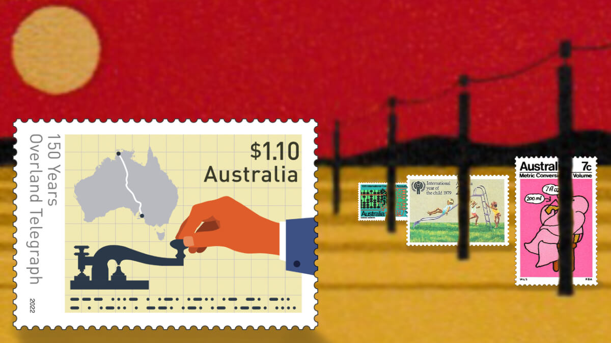
This stamp marks the 150th anniversary of Australia’s Overland Telegraph line. I loved it as soon as I saw it previewed in the Stamp Bulletin. To quote a much-loved Australian movie line, it’s just the vibe of the thing.
The design doesn’t mess around. Without reading the inscription, you can see that this was a connection across the Australian continent, used by telegraph operators to send messages in Morse code with their telegraph keys. Boom. Job done. The graph-paper background works for me too.
The simple imagery, the colours, the subtle educational touch. It’s a stark difference to much modern output and a glorious throwback to modernist designs of the 1970s, an era that I love. Monochromatic engravings of royals and wildlife had by then made way for new printing techniques, vibrant colours, and symbolic flourishes.
In this era, stamps increasingly took on new roles: the public service announcement, the tourism advertisement, the civics teacher. Some stamps of the era smack you over the head with information; others took a gentler approach. Oh look! I guess it’s Happy 50th Birthday to the ‘100th Anniversary of the Overland Telegraph Line’ stamp.
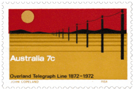
was a VERY BIG DEAL.)
This era goes largely unloved by Australian collectors. The grandpas had their fingers burnt on the great ‘stamp investment’ boom that went bust. The glut of this material on the market is now slowly being eroded by stamp dealers using their unsellable stock on their mail.
It does mean cheap pickings for collectors with broader minds and an interest in the art of illustration, but in defence of my fellow collectors of this era, it’s not all bargain-basement. This guy appeared in some colourful 1973 stamps to teach us how to convert weights and measures to the metric system, because we’re not afraid of new things like Americans are.
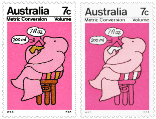
The guy on the left is worth 40 Australian cents. The guy on the right (sorry for the patched-up old scan) is missing the olive colour. He’s worth $2000! Sadly, that’s not what I got when I sold him a few years back, because catalogue prices are always a little overblown. But I thought I saw a bump for modern missing colour errors at a more recent auction. Get on board.
Whether they’re realistic or abstract, each of these stamps is a testament to the designer’s art. Which brings me to my next point, something I’ve been mulling over since I took part in this survey: where have all the illustrations gone?
24 of the 37 issues in this survey have photos as their dominant artistic element. Only 13 issues were not based on photos. And four of those only just scrape into the category because they happen to depict pre-existing illustrated material. Not counting territory stamps, only six mainland ‘Australia’ issues involved an artist creating an original work from a blank page.
I reviewed the 2022 output from a bunch of culturally comparable nations, and failed to find one where the year’s stamp designs were so dominated by photographs. The closest I found was the UK, with about a 50% ratio.
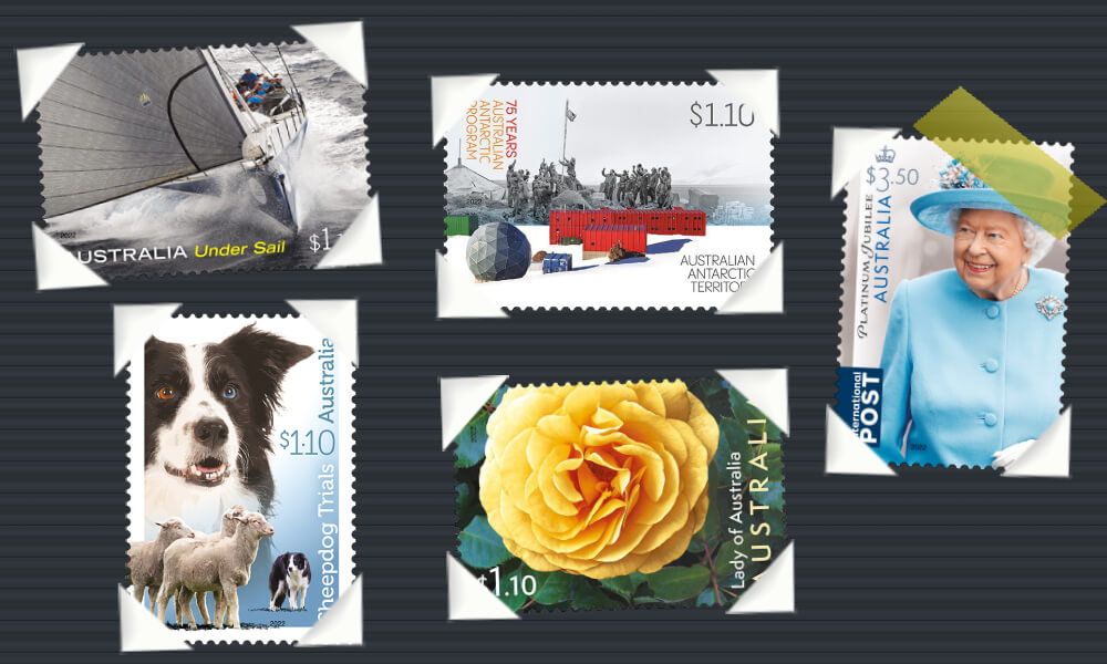
Call me old-fashioned, but I just liked it more back when people drew things. I have to be honest, the avalanche of photos on Australian stamps these days has me rapidly losing interest. Every now and then an Overland Telegraph or Australian Dinosaurs issue still gets my juices flowing, but in between them, I feel like I’m leafing through someone’s photo album. Here’s a yacht. Here’s a dog. Here’s our camp from that time we went to Antarctica. Here’s a flower. Here’s someone’s grandma who used to live in England.
I’m not criticising the photography; much of it is brilliant and several photo-based stamps were in my top 10. Photography is art, I get it. I’m just asking… do we need THIS MANY PHOTOS?
Australia Post has a reputation for issuing stamps far in excess of postal needs, and I’m guessing this is a symptom. It’s got to be faster and cheaper to lay up some photos and churn’em out than to commission artists to creatively interpret every subject. I’d be curious to hear from any little birds inside AP who can enlighten me on how this obsession with photography has come about.
I find stamps vastly more interesting when a creative artist is given the chance to interpret a topic. The choices made by the illustrator add an extra layer that’s worth appreciating. Look at what Gordon Andrews did in 1972 with a very challenging brief: the Tenth International Congress of Accountants.
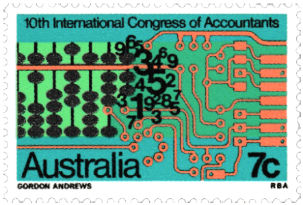
So much to unpack here. The charting of accountancy, from the abacus, through numerals, to a computer chip. The fact that designers used to get their names on the stamps like stamp engravers do. The revelation that Australia hosted so few major events in 1973 that a Congress of Accountants was considered stampworthy. And, finally, the unnerving knowledge that if we ever host this event again, the stamp will be a photo of some accountants.
Photos can be interesting, beautiful, and in some cases they are completely appropriate on stamps. The fibre art stamps above made my top three. This year’s landscape photography issues were standouts too (but three in one year?). I look forward to vibrant and engaging photos being part of Australia’s stamp output in years to come. But would it kill the budget to commission a few more works of original art?

To its credit, Australia Post’s survey also asks participants to nominate a least favourite issue and explain why. I feel for whichever poor designer winds up in the lowest place on the survey, so I won’t say which design was relegated to the bottom of my list. But I will say that it struck me as a phoned-in effort that made me angry every time I saw it, and it was nice to have an official outlet for my pent-up rage. Thanks, Aussie Post.
If you’ve read this far down, you might be wondering where I get off ranting against photo-stamp issues when I just nominated one as my favourite for the year. But look closer. If I’m reading designer Gavin Ryan’s blog right, they’re not photos, they’re clever designs involving 3D modelling, texturing, and a bunch of other graphic tricks that I’ll never master. Brilliant.
Now, here’s your homework: what does the Morse code say in the Overland Telegraph stamp? Don’t spoil it in the comments! Instead, take a look at the voting form, and even if you don’t vote, I’d love to hear which issue you liked the most. Even if it’s a photo.
When the blog goes quiet, I’m still online! Come and say hello on Facebook, Instagram, and as of the moment I hit publish on this post, I’m still hanging in there on Twitter!
© Philatelic product images remain the copyright of issuing postal administrations and successor authorities
Discover more from Punk Philatelist
Subscribe to get the latest posts sent to your email.

Yes! Here’s to illustrated stamps over photographs. Or, as you say, a better balance. I suspect the photos are cheaper to license vs. commissioning an artist to create something custom. We need 4 dogs! Make ’em cute! 🙂
The 100th anniversary telegraph stamp is stunning. It’s wild how the simplicity is so powerful today.
Maybe that’s the other thing about photographs – you can crop out detail, but you can’t eliminate it. Everything in the frame has equal detail. There is beauty in the (designed) simplicity.
As you say, there’s a big difference between the photo stamps you rank highly and the hodgepodge in the ‘photo album’ shot. They’re composed images, and very attractive ones at that.
Love your blog!
LikeLiked by 1 person
Thanks for reading, Mark! That’s a really good point about the detail. There is beauty in what an artist chooses NOT to put into an image.
LikeLike
Do people in Australia really camp in Antarctica?
LikeLike
Not really. I was being tongue-in-cheek about our scientists’ exploits down there 😀
LikeLiked by 1 person
I feel the same way you do about illustrated designs. There’s just something more charming about them.
LikeLike
very clever, the Morse code on the stamps. yes I got it. am not into Photographs on stamps – generally speaking – a few exceptions I guess – I prefer pre 1960s and the engraved issues. as you might see from my own blogs All the best michael cddstamps.wordpress.com
LikeLike
Loving you posts, Punk. And thank you for revealing what seems obvious now that you say it. When I think back at my faves over the years, they have been the illustrations and not the photos.
I vented, too, at my least favourite, which seemed to me to be a copy-paste across five designs. The poll results revealed it to be in the top 10, irritating me further!
LikeLiked by 1 person
(I approved your post but it has taken me too long to get back to some replies!) It sounds like you and I might have had the same least-favourite issue in 2022 😄
LikeLike
As an insider I can definitely confirm that yes, photographic stamps are cheaper and faster to produce. And very pleased with your top three…they took a long time to conceive and design in consultation with various artists and experts.
LikeLiked by 1 person
Always good to hear from an insider, especially one who’s prepared to confirm my hunches! 😄
LikeLike