
So COVID-19 lockdowns are starting to loosen up a little. In some places, it’s because the worst is (hopefully) over. In other places, it’s because leaders have decided that tens of thousands of dead are less important than advertising canned beans. Then there’s my hometown of Melbourne, Australia. Just as we were tiptoeing back into the pub, a randy security guard at a quarantine hotel may or may not have given a newly-returned traveller a VERY thorough inspection, and here we are, locked down again.
Thankfully, a second wave of COVID-19-inspired online philatelic innovations has hit. And let me tell you, the word ‘virtual’ has not had this big a workout since 1998.
The American Philatelic Society (APS) will run a six-day Virtual Stamp Show from 17-22 August, 2020. That’s in addition to its ongoing live online Stamp Chats, previously mentioned here, which have continued over the last few months. Forthcoming topics and YouTube clips of past chats can be found here. I’ll be making another appearance soon!
Across the pond, Britain’s Philatelic Traders’ Society (the PTS) is cooking up its Stampex International Virtual Exhibition from 1-3 October, 2020. I was due to visit the real-life Stampex back in May, but of course COVID-19 forced the cancellation of the exhibition, my holiday, and pretty much everything else. Thank goodness my local microbrewery home-delivers.
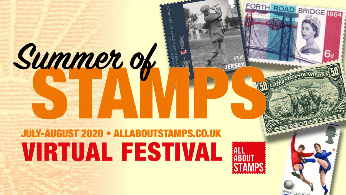
But before we get to those events, UK mag Stamp Collector has launched a Summer of Stamps via its online portal, www.allaboutstamps.co.uk. (It started last week. I was a bit slow to notice it. I’m in the depths of Southern Hemisphere winter here, it took a while to feel the warmth.)
The Summer of Stamps runs for a month, which, I understand, is how summers usually work in the UK. This virtual festival’s new daily content includes a dealer marketplace, presentations from experts, and displays of topical and specialist material from experts and societies.
Some big fish are involved, like the British Library, the Royal Philatelic Society, the APS, and The Postal Museum. Insignificant minnows are also involved, which is why you might even find a video with me in it!
One of the Festival highlights will be the July 25 exclusive free screening of Freaks & Errors: A Rare Collection, a documentary feature covering the eccentricities of the stamp world and the collectors who populate it. (I’ve got a hunch that the ‘freaks and errors’ bit does not refer to the stamps.)
The English Channel island of Jersey has used the festival to launch its issue commemorating golfer and six-time British Open winner, Harry Vardon. I’m no expert on Harry, but I just learned that the Vardon Grip is still used by most pro golfers to this day. Not bad for a bloke who never took a golfing lesson. Harry obviously means a lot to the Jerseyese, and this set is a must-have for collectors who like lots of stamps of one specific guy playing golf.

I’ve found plenty to inform and entertain me so far in the Summer of Stamps. I enjoyed an article and Postal Museum video interview with designer David Gentleman, who revolutionised the appearance of British stamps in the 1960s. I hadn’t heard this story in detail before. The obligation to include an enormous photo of the Queen on commemorative stamps was a burden for stamp designers back in the day. So a radical campaign began for change. The Queen was receptive to change, but only so far, and the result was the far less invasive silhouette of her head that now appears on UK stamps.
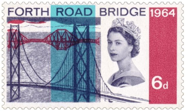
In my Summer video, I talk about my love for modern British stamp designs. Now that I know more of the back-story to how we got here, I hereby admit David Gentleman and the postmaster-general of the day, Tony Benn, to the esteemed Meritorious Philatelic Order of the Punk. It’s the highest honour in all of philately, if not the world.
A short postal history display from the Forces Postal History Society taught me about the Baltic Battalion, a joint peacekeeping force formed by Estonia, Latvia and Lithuania in 1993. It’s a good example of how a tiny little corner of specialist philately can become an exhibit. And as someone with more than a passing interest in Estonia, I learned something I didn’t know.
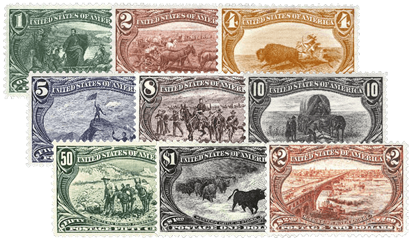
Many of the APS Stamp Chats have also been incorporated into this festival. Why not start with Casey Jo White’s chat on the USA Trans-Mississippi issue of 1898? These stamps highlighted the development of the American west, so it’s a shame that one of them actually depicts a scene from Scotland. Which one? Watch and find out! (Don’t be dissuaded by the hour-long runtimes on those APS chats. Usually the presentation goes for about half an hour. The rest is the Q&A afterwards.)
Want to win stuff? You can enter the inaugural All About Stamps Competition. Unlike ‘proper’ exhibitions, you don’t need a shipping container’s worth of material; all it takes is one scanned A4 page on a philatelic topic of your choosing. Get your entries in by July 28. There’s a competition for kids too (up to age 14, divided into three age groups). Entrants submit an A4 presentation of stamps that “take us on a world tour.” Entries to both comps will be displayed on the festival site. In the case of the grown-ups, the public can vote to determine the shortlist which will then be judged.
On your way out of the Summer of Stamps, don’t forget to pick up your ‘virtual goody bag’. It’s a bunch of discounts and special offers, and is vastly preferable to several other things you might usually pick up in summer.
The Summer of Stamps runs until Sunday 9 August. Have you a blast!
(I tried to think of a musical pun title that encapsulated both ‘summer’ and ‘stamp collecting’. It was hard. ‘Friendless Summer Nights’ felt a bit too mean.)
Hit the Follow button or submit your email to hear about new Punk posts as they appear! You can also find me on Facebook, Twitter, and Instagram!
Discover more from Punk Philatelist
Subscribe to get the latest posts sent to your email.

I really enjoy your Aussie sense of humor! Keep on!
“Fellow” stamp collector– actually 80 yr. old female.
LikeLiked by 1 person
Thank you for reading, Sharon, and for taking the time to say those kind words! I’ll keep the Aussie humour coming as best I can, just for you.
LikeLike
Since this is about summer and since you mentioned Jersey…one of my favorites has always been the Jersey tourism issue of 1975. A very colorful and striking design with Welcome to Jersey in six languages, and in the middle a sea shell, beach chair and umbrella, a sand castle…all with a stylish ‘J’ weaved into the design. Superb!
LikeLike
I just went and looked up that issue. What a charming, colourful set! I probably would have missed the Js if you didn’t mention them. Thanks Robert!
LikeLike