
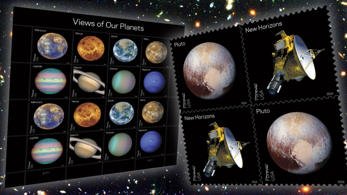
Well, look who’s come crawling back to his sorry blog! Sorry, punksters, I’ve had a ridiculously busy year in both my top-secret work life and my even more mysterious private life. But given that it feels like I’ve been lost in outer space lately, it seems appropriate to return with one of the many doozies of new issues from 2016 that I missed while I was gone. Regular readers would know I’m mad for a pretty space stamp, and didn’t the USPS fire my rockets in May with its gorgeous Views of our Planets release?
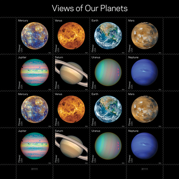
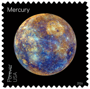
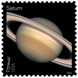
No messing about here. The USPS picked some of the sweetest full-disk images of the planets in our solar system and chucked eight of them on stamps (and a minisheet). Viewed up close, they are simply stunning. I have so much more time for Mercury now.

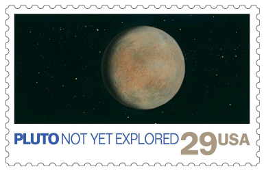
Pluto, of course, was demoted to the cosmic equivalent of the children’s table in 2006. But to keep the Pluto truthers happy, NASA gave Pluto a whole release all to itself on the same day, marking the 2015 flyby of NASA’s New Horizons spacecraft. One stamp depicts Pluto in all her glory, with her now-trademark loveheart on full display, and the other, New Horizons itself.

I’m generally a but meh about photographs on stamps, because I find they’re often used dully. But when those photographs are taken by multi-million-dollar spacecraft through fancy scientific lenses that make heavenly bodies look even more heavenly than they do to the naked eye, then I am all for it.
If you missed the side-story, this Pluto issue put to bed a philatelic grudge. The USPS released a planetary issue in 1991, which featured Earth’s moon and the planets, along with images of spacecraft that had been significant in exploring each celestial body. But back then, we hadn’t got to Pluto yet. Poor old Pluto got a ‘TBA.’

That ‘not yet explored’ post-it note must have stuck in someone’s craw at Space HQ. Not only is this year’s release titled “Pluto – Explored!” in a direct face-slap to the 1991 stamp, but the team behind New Horizons reportedly stuck one of the 1991 stamps on the New Horizons probe. No doubt this got as much respekt from the world as I got from my friends when I stuck a bicycle stamp on my actual bicycle.
NASA released this adorable photo of the New Horizons team using philately to make their point on the day of the New Horizons flyby. I do love it when nerds collide.
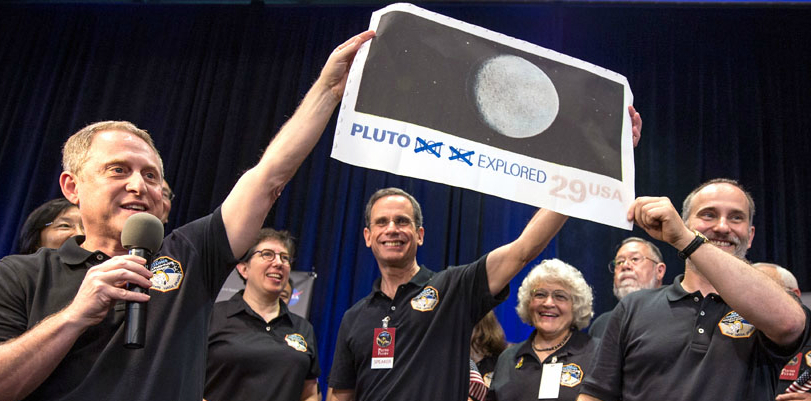
That stamp now officially holds the Guinness World Record for the farthest distance travelled by a postage stamp. And it’s still going, heading off to investigate the Kuiper Belt. If I am to achieve my dream of beating this record, I’ve got some cycling to do.
Thanks for indulging my absence. I hope to get a few more blogs away over the next few weeks covering some of my fave issues of 2016. In the meantime, a happy festive season to you if that’s your thing right now, and hopefully we’ll see more of each other in 2017!
People bloody love space stuff on social media. You should share this post on yours, and bask in the Likes. You can follow me on Facebook, Twitter, and Instagram!
© Philatelic product images remain the copyright of issuing postal administrations and successor authorities
Discover more from Punk Philatelist
Subscribe to get the latest posts sent to your email.

I don’t understand why some planets are in ‘real’ natural colors, and others, especially the Jupiter one are not in real colors, but changed to highlight certain parts. To be honest, I think this issue is a complete mess. Mercury is not in real colours, Venus is a ‘radar’ version, Mars and Earth have clouds, Jupiter is totally not in ‘natural’ colour, Saturn looks OK, Uranis is I think from Hubble and Neptune looks fantastic, thanks to Voyager 2.
LikeLike
I love your passion, Giacomo! My guess is that some of the planets, viewed in ‘natural’ colors, are quite dull. But what are ‘natural’ colors, anyway? They’re only the colours that we humans perceive with our limited eyes. The USPS’s own description of these stamps said ‘Some show the planet’s “true” color — what we might see with our own eyes if traveling through space. Others use colors to represent and visualize certain features of a planet based on imaging data. Still others use the near-infrared spectrum to show things that cannot be seen by the human eye in visible light.” Each of the images represents qualities inherent in the planet, whatever manner we came to learn of those qualities. It’s a celebration not just of the planets, but of the photographic technology that helps us to understand them. That’s how I see it, anyway!
LikeLike